March 12th, 2018.
It's 11:07 on Monday night, and I'm writing this under a cloud of black smoke coming from a smoldering automobile scrap yard fire. There's an evacuation in place for our neighborhood two blocks up wind, but the EPA deems that the level of toxins over our place is at an acceptable level for humans. Okay. A moment like this does offer an opportunity to learn a thing or two about tires and tire fires - like this: One auto tire contains about 2 gallons of petroleum products. 2 gallons! When that tire is on fire, the smoke can carry fine particulate matter and other nastiness which may include asbestos, aldehydes, nitrogen oxides, polycyclic aromatic hydrocarbons, benzene, toluene, styrene, metals and dioxins. Interesting stuff. The kind of thing that one does not think about unless it appears in their backyard, or in the air directly above them.
Well, whether or not we're breathing that stuff in right now, that cloud has colored my thoughts a bit - I had intended to write about inspiring printing, not burning tires. We have enough garbage in our lives, I don't need to fill your eyeballs with more of it.
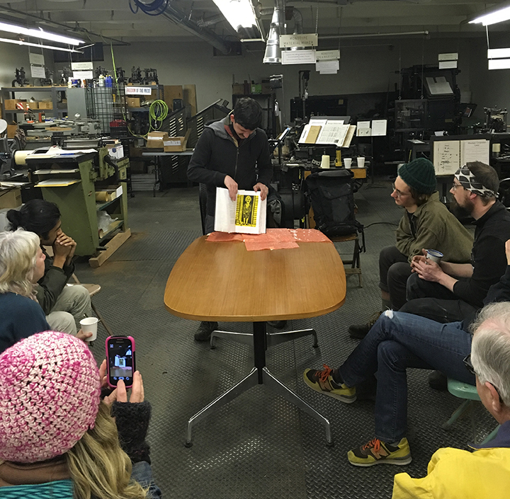
Which brings me to the topic that I had intended to write about in the first place: A recent “Type Jam” at the C.C. Stern Type Foundry featuring Mark Sarigianis of Prototype Press. There we saw a jaw-dropping example of the beautiful things people make - which is a heart warming antidote to the apocalyptic-trash-cloud that we're currently experiencing. The attendees of this Type Jam had the opportunity to take a first look at Mark’s recently completed fine press edition of Charles Bukowski’s “Ham on Rye.” In an edition of 52 copies, this 364 page, 5 pound (my guess) humdinger of a book is the result of two years of labor, love and even a healthy dose of suspense.
Set in 12pt Goudy Powell and cast by Mark on the Prototype Press Monotype comp caster, the typeface has a wobbly but stout appearance - fitting for the words of the professional drinker that Bukowski was. Nothing delicate about those letterforms, but there's poetry within that typeface all the same, and it holds the ink beautifully on handmade cotton paper from St. Armand. The book is illustrated with wood cuts by Sean StarWars. The illustrations are over printed on tint blocks which alternate with Cyan, Magenta and Yellow. The utilitarian color-tool-box of the commercial printer. Another nod to Bukowski's working class story.
Rebecca and I visited Mark about a year ago, shortly after the building where his shop is housed was sold. The new building owners required that his shop space be partially deconstructed. This was in the middle of the first half of printing Ham on Rye. We found him working away under blue tarps and five gallon buckets which were catching in-coming rain water. Mark was in the process of recycling forms that had been printed in order to make room and more type for the remaining pages of the book. Yikes. This is a stage of the book production where if a mistake is made; days, weeks, months are lost. A keen focus on triple-checking galley proofs and printed final sheets is critical. Yet Mark was undeterred. Under adverse shop conditions with no guarantee that the new building owners would continue to rent to the current tenants, the progress of the book hardly slowed. Pretty nerve wracking, I'd say. It is challenging enough to maintain old type casting and printing equipment so that it is capable of producing this level of fine press book work, so I find it very inspiring that Mark was able to forge ahead under the tarps and uncertainty of the immediate future of the shop location. Mark's edition of Ham and Rye is truly a beautiful monument to the poetry of the every day struggle that Bukowski is celebrated for.
Take that, tire fire.
Check out pictures and a much more thorough description of the book here at the The Whole Book Experience blog.


